
Genice Chan on BNA and Collaborating with Studio Trigger
The illustrator and animator discusses the pre-production process, balancing animal and human designs, and … Snuggies?
Studio Trigger is no stranger to cross-cultural exchange. Their anime projects (Promare, Kill la Kill, Little Witch Academia) frequently pull inspiration from Western sources ranging from American children’s cartoons to Hollywood blockbusters. Their latest merging of East and West comes in the form of an unexpected hire: the young Chinese-Canadian illustrator and animator Genice Chan (Twitter, portfolio site), who works at Canadian studio Giant Ant but provided concept designs and directed the ending animation for Yoh Yoshinari’s noir-tinged anthropomorphic animal saga BNA. Yoshinari is himself a fan of Western animation, but Genice’s colorful, graphic style really grants BNA a unique look and feel compared to its Japanese contemporaries.
In a podcast episode available exclusively for Ani-Gamers Patreon subscribers, I sat down with Genice for a lengthy interview covering her remarkable career, striking art style, and the challenges and rewards of working remotely with the Trigger team. The following transcript covers a small portion of our conversation. For the full interview, subscribe for $5 a month on the Ani-Gamers Patreon!
Ani-Gamers (Evan Minto): You worked with Yoh Yoshinari and other members of the team during the design phase. What kind of references did you use during that process?
Genice Chan: In the very beginning there was a Pinterest board. But then, throughout the production, they would also put together packages of reference pics of the direction they had in mind and stuff like that. Then on calls, they’d be like, “what should this character’s cloak look like?” And I’d send them a picture of a Snuggie. Then they’d send me a picture of these Star Wars soldier dudes. The stormtroopers or the red robe guys.
Ani-Gamers: Oh wow yeah! That could either be the ones from Return of the Jedi or The Last Jedi.
Chan: Yeah I think for that conversation it was about Nazuna’s cape. They were like, “we want her to have a cape but we want her arms to be able to stick out.” So I’m like … “cape where the arms can stick out … a Snuggie?” They were like “what’s a Snuggie?” so I said “here’s a Google Image pic” and they like “huh, no.” And then I think it was [Trigger producer] Will Feng that was like “how about those Star Wars dudes?”
Ani-Gamers: What kind of adjustments did you have to make to your art style for BNA?
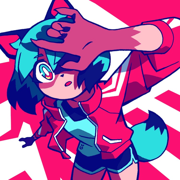
Chan: I kind of see my style as a toolbox where I have a bunch of different tools. Depending on the needs of a piece or a project I just pick up different tools and throw them together. I think for BNA, what they liked from me is probably the colors, but also maybe the graphic-ness. And the focus on shape language in some of my work. So when I did image boards and stuff for them, that’s kind of the area that I leaned into. (EDITOR’S NOTE: Image boards are colored pre-production sketches showing vignettes of key scenes and locations.)
Ani-Gamers: So you got initial sketches from Yoshinari and then did image boards based on those?
Chan: What I was doing was a mix of character design and image boards, or character concept design. So for character concept designs, a lot of it was based on sketches that I would receive from Yoshinari. For the image boards, sometimes I only had the script to work off of. Other times there were also storyboards, which are usually by a mix of people.
Ani-Gamers: It sounds like you were integrated on an episode-by-episode level, not just doing a bunch of overall pre-production for the style of the show. You were actually on each episode getting in and designing stuff?
Chan: Yeah. There are a few things that ended up directly in the show, which I think is pretty cool.
Ani-Gamers: What are some of them that you’re proud of?
Chan: For the sequence in episode eight with Shiro’s backstory, the art style change, I got asked to do the visual development for it. I did some frames for them and some of my art ended up in the final scenes.
Ani-Gamers: You were the character concept designer, but Yusuke Yoshigaki adapted your designs into the final animation-ready ones. How closely did you work with him?
Chan: I actually never interacted with him. Would love to though.
Ani-Gamers: Wow, so you basically left sketches and notes and things, and then it was communicated through Yoshinari or [producer] Naoko Tsutsumi?
Chan: I think Yoshinari and Tsutsumi would pass things down to people. I would write stuff when I could think of stuff to write, and then everything needed to get translated. I’m not actually sure how much of the stuff I wrote got translated. I think sometimes not all of it was.
Ani-Gamers: How developed were the initial sketches from Yoshinari when you got them? How many of the decisions were already made about what the characters were going to look like or even what animals they were going to be?
Chan: For the main and side characters, everyone that has a role in the story, they decided the animals. In my opinion Michiru and Shiro’s designs aren’t too far off from the very early concepts. But for the rest of the people there’s quite a mix.
There are some that I didn’t get any sketches for. For example, Mayor Rose. I think that was mostly from scratch. There are other ones where I got a bunch of sketches, but they’re in a lot of different directions. So what I do is I kind of pick and choose a few things, put my own spin on it, and then send it back to them.
Ani-Gamers: There are a few designs in the show that read as more “anthro” or “furry” designs than the other ones, particularly the ones with larger snouts. Was that something you were specifically going for?
Chan: I think whenever I designed people’s beast forms, I tended to lean a bit more anthro or animalistic, but then in production it sometimes got pulled a little bit back. For example, I think I’ve done one or two concepts of Nazuna’s fox form and I always gave her a bit more snout. But then in the final version her face is a bit more similar to Michiru’s, which is kind of flat.
Ani-Gamers: Did you have any involvement in the show once it hit the animation phase? Were you consulting at all or taking a look and making sure things still matched up?
Chan: No, basically I just handed stuff in and they took it wherever they wanted. I think it’s also tough because I’m overseas and working remotely. There’s the time difference and also the language barrier.
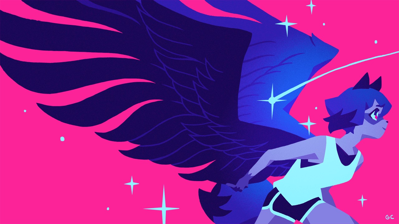
Ani-Gamers: The ending animation has an even more pronounced neon-colored art style than the rest of the show. How did you land on that? Were you worried about it not fitting in with the rest of the show?
Chan: I was a bit worried. At one point I asked Yoshinari, “are these colors too bright?” I’ve been looking at this for so long. I feel like I’m kind of getting blinded by this pink.” And he was like, “no, it’s fine. Don’t worry about it.” Which was nice.
I think the color direction of the ending was guided by a few things. First of all, there was the Pinterest board from very early in the pre-production. I think it was Tsutsumi or something that put it together and that’s kind of the reference I had to guide the style I used for image boards and stuff. When they asked me to do the ending, they said they really liked the image boards I had done and they wanted something in that realm. They also liked the first key visual illustration that I did, and they were interested in having something in that style. Also, I think around that time I had also watched Promare and I really liked the version of the credits that I saw when I went to see it in theaters. It was this bright pink with black text on it. It’s simple but really slick. So that was on my mind as well. When I designed the BNA ending credits I tried to mix all those things together.
The other thing I had to keep in mind was that our manpower and our timeline was pretty limited. So I had to come up with a lot of ways to simplify things and make life easier for my animators.
Ani-Gamers: What were some of the simplifications?
Chan: First of all the backgrounds are really simple. There are a few scenes where we reuse the animation too.
Ani-Gamers: The ones where Michiru is split into four mirrored versions of her?
Chan: Yeah, you just change the color palette, but it’s really one animation.
Ani-Gamers: Right. It’s a great example of how that stuff can look great even when you’re cutting corners, because you’re doing it in a creative way.
Chan: Yeah, exactly. I think those were the main ones. Like the run cycle in the first scene is the same one as the one in the stars scene. Also, in each scene there are only one or two characters.
Ani-Gamers: You have this really unique experience of having your day job at a North American animation studio and then doing work with a Japanese studio. Were there any big differences you noticed in the process or even just the creative outlook that the team had at Trigger?
Chan: First of all, my experience with studios is super duper limited. I basically interned at a TV animation studio on a kids TV show doing background layouts. And then I’ve been at Giant Ant, and then I’ve worked for Trigger. But I would say the differences that I noticed are more differences in the industries that we’re in.
For example, at Giant Ant we specialize in motion graphics. We do a lot of one-off short projects that focus on advertising, presenting an idea or product. Also, we’re a very small studio and team. So what happens is a lot of people do work in multiple areas, and then everyone’s in positions that kind of change depending on the project.
Whereas with TV animation and bigger studios, the project is more long-form. There’s a bit more of a focus on telling a story and developing characters and stuff. Also, because the studio and the project is bigger, each person’s role is smaller and more specialized. That’s just what I’ve noticed.
I think there’s a bit of difference between the Eastern and the Western approach towards animation as well. I think in school and watching Disney or whatever, there’s a lot of emphasis on high budget equaling high frame rate and staying on model, etc. Limited animation is associated with cheap, lower budget animation, whereas something that I find very interesting in anime is the use of limited animation in a high budget way.
Ani-Gamers: Yeah, the frame rate modulation techniques that they do.
Chan: Yeah, I think that’s super cool. But I also noticed that as both of the industries develop, there’s more overlap between the techniques that people use.
Ani-Gamers: And overlap in staff, as you’re evidence of. Thanks so much for your time Genice!
Chan: Thanks for having me!
For the full interview in podcast form, subscribe for $5 a month on the Ani-Gamers Patreon!
Note: All images in this post are original artwork by Genice Chan!